# Recommended Layers Structure for Smart Importer

<span style="vertical-align: inherit;"><span style="vertical-align: inherit;">This page shows you how to set up items so that Smart Importer automatically detects the items and their nested group items as controls when you import Adobe Photoshop (.psd), Adobe XD (.xd), o Figma (.fig) files.</span></span>

<p class="callout info"><span style="vertical-align: inherit;"><span style="vertical-align: inherit;">Smart Importer can automatically assign only controls in the ***Touchable, Common** and **Core*** categories.  
</span></span></p>

---

#### <span style="vertical-align: inherit;"><span style="vertical-align: inherit;">Creating Design Files</span></span>

To enable the automatic application of controls to group items in a design file and their subsequent import into Scene Composer, group items must be created following the recommended layer structure.

The recommended layer structure is primarily designed to support the text-related and image-related properties of a control. By creating layers that correspond to these properties and naming them according to the associated Scene Composer property names, the Smart Importer can automatically identify and map the layers to the appropriate control properties.

The following sections provide detailed instructions for creating the required layer structure.

##### <span style="vertical-align: inherit;"><span style="vertical-align: inherit;">For Adobe Photoshop（.psd）Files</span></span>

<span style="vertical-align: inherit;"><span style="vertical-align: inherit;">You can create controls from Photoshop layer data as follows:</span></span>

<div class="contents" id="bkmrk-create-a-group-item-"><div class="contents"><div class="contents"><div class="contents"><div class="textblock">

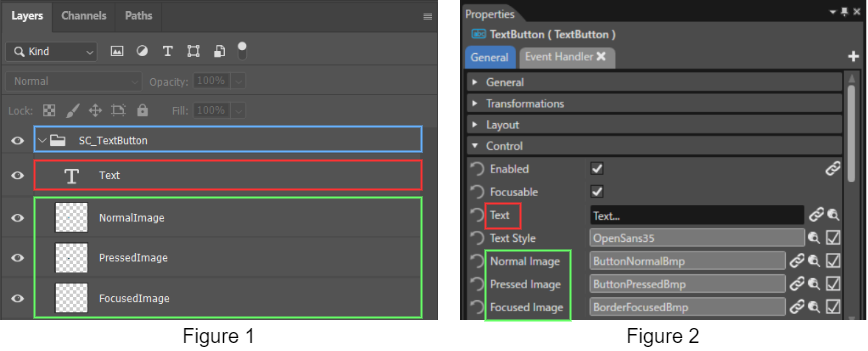
1. <span style="vertical-align: inherit;"><span style="vertical-align: inherit;">Create a group item for the control that you want Smart Importer to assign and name it "SC\_*&lt;ControlName&gt;*". For example, name the top layer "SC\_TextButton" to make a TextButton control (see blue box).</span></span>
2. <span style="vertical-align: inherit;"><span style="vertical-align: inherit;">Under the group item that you created in step 1, create property layers for the desired control (see red and green boxes).  
    These properties include text-related properties (e.g., Text, FirstText) and image-related properties (e.g., NormalImage, PressedImage).  
    </span></span>
3. <span style="vertical-align: inherit;"><span style="vertical-align: inherit;">Use the control properties names for the Photoshop layer names. Delete any spaces in Photoshop layer names (see green boxes for comparison)</span></span>

</div></div></div></div></div><div drawio-diagram="3874"><img src="https://doc3161en.candera.eu/uploads/images/drawio/2023-06/drawing-7-1686313199.png" alt=""/></div>

<div class="contents" id="bkmrk--0"><div class="contents">  
</div></div><p class="callout info">The Smart Importer automatically recognizes and maps a group item that is named SC\_&lt;ControlName&gt;” in the design file.  
You are not required to create layers for all text-related and image-related properties of the control. Even if only the required properties are created as layers, the control will still be applied correctly.</p>

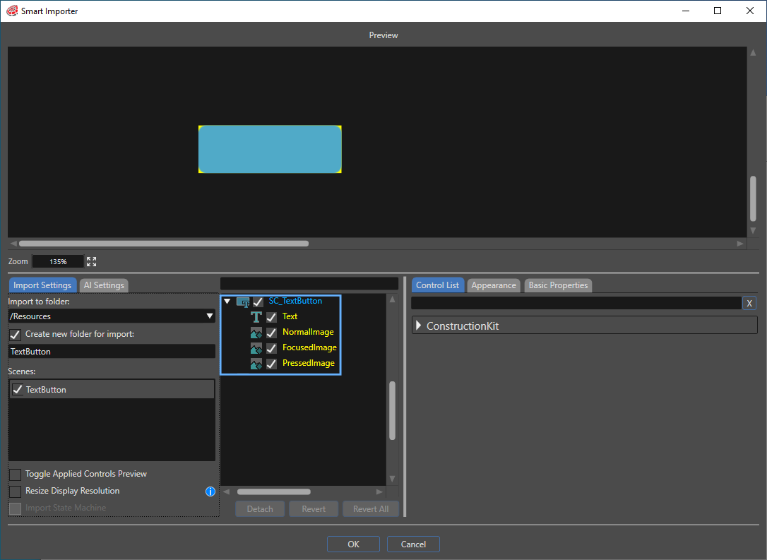
<span style="vertical-align: inherit;"><span style="vertical-align: inherit;">After following the steps above, select **Import &gt; Smart Importer &gt; From Local File... from the Scene Composer toolbar, then select the finished Photoshop file. Smart Importer opens the **Smart Importer** panel, loads the file according to the .psd layers that you configured, confirms the TextButtonControl, and applies it, as you can see in the image below.</span></span>
<div drawio-diagram="6772"><img src="https://doc3161en.candera.eu/uploads/images/drawio/2024-09/drawing-5-1726226385.png" alt=""/></div>

<div class="contents" id="bkmrk-each-property-on-the"><div class="contents"><div class="textblock">  
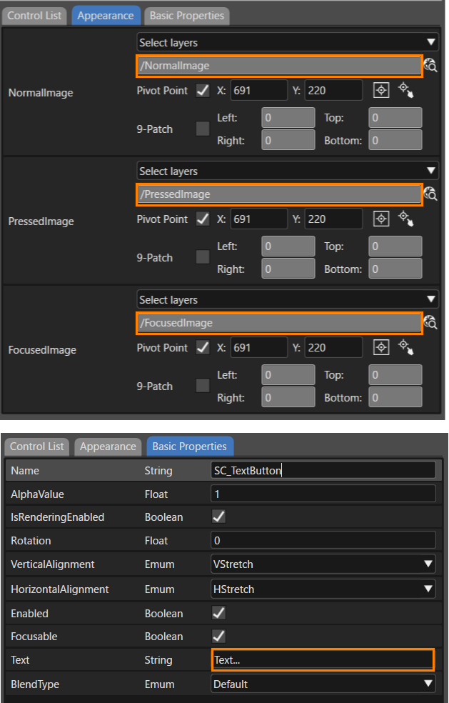
</div><div class="textblock">Each property on the **Appearance** and **Basic Properties** tabs reflects the layers that you set in the .psd file.   
</div><div class="textblock"><div drawio-diagram="7037"><img src="https://doc3161en.candera.eu/uploads/images/drawio/2024-10/drawing-4-1729219437.png" alt=""/></div>

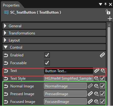
</div></div></div><div class="contents" id="bkmrk--7"></div><span style="vertical-align: inherit;"><span style="vertical-align: inherit;">The **Properties** panel also reflects these settings after Smart Importer completes the import</span></span>.

<div drawio-diagram="6774"><img src="https://doc3161en.candera.eu/uploads/images/drawio/2024-09/drawing-5-1726226731.png" alt=""/></div>

<div class="contents" id="bkmrk--10"><div class="contents"><div class="textblock">  
</div></div></div><div class="contents" id="bkmrk-the-size-of-the-impo"><div class="contents"><div class="textblock"><dl class="note"><dt></dt><dd><p class="callout info"><span style="vertical-align: inherit;"><span style="vertical-align: inherit;">The imported control's size matches the width and height of the largest image layer that you applied.</span></span></p>

</dd><dd></dd></dl></div></div></div><span style="vertical-align: inherit;"><span style="vertical-align: inherit;">When Smart Importer imports nodes with mismatching layers and properties, it creates new group nodes and additional properties as child elements.</span></span>

##### For Adobe XD（.xd）Files

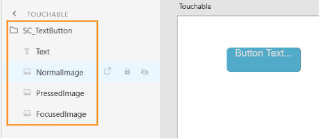
Prepare .xd files in the same way as described in<span style="color: rgb(230, 126, 35);"> [For Adobe Photoshop (.psd) Files](https://doc3161en.candera.eu/link/84#bkmrk-adobe-photoshop%EF%BC%88.psd)</span>. Structure the Adobe XD items to match the structure and property names of the controls that Smart Importer automatically applies.

<div drawio-diagram="3877"><img src="https://doc3161en.candera.eu/uploads/images/drawio/2023-06/drawing-7-1686313818.png" alt=""/></div>

##### For Figma（.fig）Files 

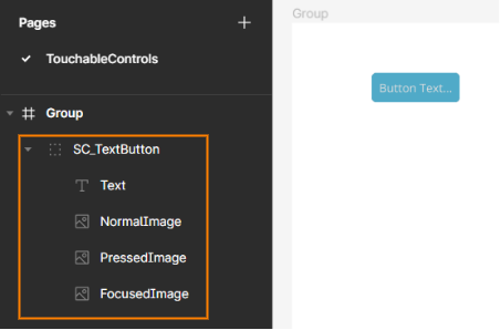
Prepare .fig files in the same way as described in <span style="color: rgb(230, 126, 35);">[For Adobe Photoshop (.psd) Files](https://doc3161en.candera.eu/link/84#bkmrk-adobe-photoshop%EF%BC%88.psd)</span>. Structure the Figma items to match the structure and property names of the controls that Smart Importer automatically applies.

<div drawio-diagram="3876"><img src="https://doc3161en.candera.eu/uploads/images/drawio/2023-06/drawing-7-1686313403.png" alt=""/></div>

---

<div class="contents" id="bkmrk--41"></div>#### Layer Structure and Naming Guideline for Controls

In general, keep the PSD layer format close to the standard controls. Use the following guide to format and name layers for some controls.

##### Touchable

- **Button**  
    SC\_Button  
    ├ NormalImage  
    ├ PressedImage  
    └ FocusedImage
- **CheckBox**  
    SC\_CheckBox  
    ├ Text  
    ├ NormalImage  
    ├ PressedImage  
    ├ SelectedImage  
    ├ SelectedPressedImage  
    └ FocusedImage
- **MultiStateButton**  
    SC\_MultiStateButton  
    ├ Text  
    ├ StateImages0  
    ├ StateImages1  
    ├ StateImages2  
    └ StateImages3
- **ToggleButton**  
    SC\_ToggelButton  
    ├ FirstText  
    ├ SecondText  
    ├ FirstImage  
    ├ FirstPressedImage  
    ├ SecondImage  
    └ SecondPressedImage

<div class="scriptor-paragraph" id="bkmrk-%60%60%60plaintext"></div><div class="scriptor-paragraph" id="bkmrk-sc_button"></div>##### Common

- **AnalogClock**  
     SC\_AnalogClock  
      ├ SecondsNeedleImage  
      ├ MinutesNeedleImage  
      ├ HoursNeedleImage  
      └ FaceImage
- **Gauge** SC\_Gauge  
      ├ BackgroundImage  
      └ NeedleImage
- **Menu Icon**  
    SC\_MenuIcon  
      ├ Image  
      └ BackgroundImage
- **Mesh2D**  
    SC\_Mesh2D  
      └ Image

##### Core

- **CoreDial**  
    SC\_CoreDial  
      ├ KnobImage  
      ├ BackgroundImages0  
      ├ BackgroundImages1  
      └ BackgroundImages2
- **CoreTextButton**  
    SC\_CoreTextButton  
      ├ NormalImage  
      ├ PressedImage  
      ├ DisabledImage  
      └ Text
- **CoreRadioButton**  
    SC\_CoreRadioButton  
      ├ Text  
      ├ NormalImage  
      ├ SelectedImage  
      ├ NormalDisabledImage  
      └ SelectedDisabledImage
- **CoreSlider**  
    SC\_CoreSlider  
      ├ TrackImage  
      ├ TrackDisabledImage  
      ├ TrackFillImage  
      ├ TrackDisabledFillImage  
      ├ KnobNormalImage  
      ├ KnobPressedImage  
      └ KnobDisabledImage

<div class="contents" id="bkmrk-analogclock-secondsn"><div class="contents"></div></div>