# View Editor
# Overview
**View Editor** is the feature set in SceneComposer for designing and managing [**View**](https://doc3161en.candera.eu/books/view-editor/page/view)s. You can compose screen-level Views by combining Scenes and existing Views, structure their transitions as a tree, and export the result as a Global State Machine asset. In addition, you can visually define event logic and screen transitions for each View as [**Action Chains**](https://doc3161en.candera.eu/books/view-editor/page/action-chain-editor) and reuse them as conditional processing based on input devices and the solution state by using the **ConditionOutputs** defined in ConditionBlocks created in the [**Condition Editor**](https://doc3161en.candera.eu/books/view-editor/page/condition-editor).
This page provides the View Editor feature set used to work with them. The View Editor consists of the following four panels.
For details on Views, see the [View overview page](https://doc3161en.candera.eu/books/view-editor/page/view).
| [View Definition Editor](https://doc3161en.candera.eu/books/view-editor/page/view-definition-editor) | An editor for defining screen-level Views by combining Scenes and existing Views, and for managing screen composition information. Views defined here are referenced as the common screen unit from the **View Tree**, the state machine, and the **Action Chain Editor**.
|
| [View Tree](https://doc3161en.candera.eu/books/view-editor/page/view-tree) | An editor for arranging Views in the solution as a tree and designing screen transitions based on that structure. The structure you configure is exported as a Global State Machine and used as the candidate targets for the [**JumpToView** Action behavior](https://doc3161en.candera.eu/link/582#bkmrk-jump-to-view) configured in the **Action Chain Editor**.
|
| [Action Chain Editor](https://doc3161en.candera.eu/books/view-editor/page/action-chain-editor) | This editor lets you visually define event processing and screen transitions for a View as trigger-based flowcharts. For each View selected in the **View Tree**, you associate an Action Chain and use **ConditionOutputs** created in the **Condition Editor** as branch conditions.
|
| [Condition Editor](https://doc3161en.candera.eu/books/view-editor/page/condition-editor) | The Condition Editor is an editor for visually defining conditions that are evaluated in Action Chains or assigned to the Condition properties of behaviors/Fusion as **ConditionOutputs** inside ConditionBlocks. The created ConditionOutputs can be reused as branch conditions in the Action Chain Editor and referenced from multiple locations in the solution as shared conditional logic.
|
Used together, these let you define View-based screen composition and transition logic in a consistent, unified way.
# View
A **View** is a hierarchically higher concept than a Scene. You can treat a single Scene as one screen, or combine multiple Views into a single screen state (**Composite View**). Each View represents a logical unit that defines what content is displayed and how on a specific screen, and is identified by a dedicated identifier type called **ViewIdentifier** on the engine side.
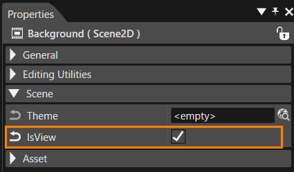
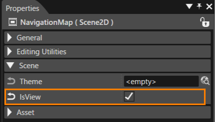
To use a Scene directly as a View, set the Scene's **IsView** property to **true**. A Scene with **IsView=true** can be referenced as is — as the transition target of **Jump to View**, as a component of a **Composite View**, and as a View output target during asset generation. The following two types are candidates that can be referenced as a **View**:
- **Composite View**: A structured View that combines multiple Views, created explicitly from the context menu of the Solution Explorer
- **Scene with IsView=true**: A Scene treated as a standalone View
The system handles View show/hide automatically as internal processing, so you do not need to configure display control elements directly. In the [**View Tree**](https://doc3161en.candera.eu/books/view-editor/page/view-tree), you define the transition structure of multiple Views as a tree, and the system outputs that information as a Global State Machine asset. By combining the **[Action Chain Editor](https://doc3161en.candera.eu/books/view-editor/page/action-chain-editor)** with the [**Condition Editor**](https://doc3161en.candera.eu/books/view-editor/page/condition-editor), you can design screen transitions and event logic per View based on input devices or solution states.
By introducing **Views** in this way, you can separate Scene-level layout definitions from screen-level transition and control logic, and organize and maintain the entire solution's screen composition consistently at the View level.
#### Creating a View (Using a Scene Directly as a View)
To use a Scene as a View on its own, set the Scene's **IsView** property to **true**. This makes the Scene referenceable as a View without going through a separate View object.
1. In the Solution Explorer, select the target Scene.
2. In the **Scene** category of the Properties panel, select the **IsView** checkbox.
- The Scene becomes referenceable as a **Jump To View** target, as a component of a **Composite View**, and as a View output target during asset generation.
- The Scene name is used as the **View Identifier** as is.
With this method, the Scene itself is treated as a View. Because the Scene name and the View name match, you can keep the entire solution's namespace tidy.
#### Creating a View (Composite View)
To create a new **Composite View** that combines multiple Views, first create an empty View item, and then add the component Views inside the **View Definition Editor**.
1. In the Solution Explorer, open the context menu anywhere and select **Add > New Item**.
2. In the left menu of the dialog, select **View**.
3. After configuring the required settings, click **OK**.
4. A new View is created in the Solution Explorer.
5. Double-click the created View to open the [**View Definition Editor**](https://doc3161en.candera.eu/books/view-editor/page/view-definition-editor), and add **Scenes with IsView=true** or other Views as components.
A Composite View created this way is a screen-level View that bundles multiple display elements, and can be referenced from the View Tree and Action Chain Editor.
# View Definition Editor
**View Definition Editor** lets you define “screen-level Views” by combining Scenes created in SceneComposer with existing [**Views**](https://doc3161en.candera.eu/books/view-editor/page/view), and make those definitions available to the **[View Tree](https://doc3161en.candera.eu/books/view-editor/page/view-tree)**, the **State Machine**, and the [**Action Chain Editor**](https://doc3161en.candera.eu/books/view-editor/page/action-chain-editor).
Only **Views** appear as nodes in the tree of the **View Definition Editor** panel. A Scene with **IsView=true** can be referenced as a View on its own, so when you want to compose a screen from a single Scene, you can place that Scene directly as a View. When you want to build a screen that bundles multiple display elements, create a **Composite View** and combine **Scenes with IsView=true** or other Views as its components. For details, see [**View composition**](#bkmrk-view-composition) later in this document. With this structure, the state machine can consistently treat “which screen (View) to activate” at the View level, while still incorporating Scene-based content into the screen composition.
### View Definition Editor UI
#### Panel layout
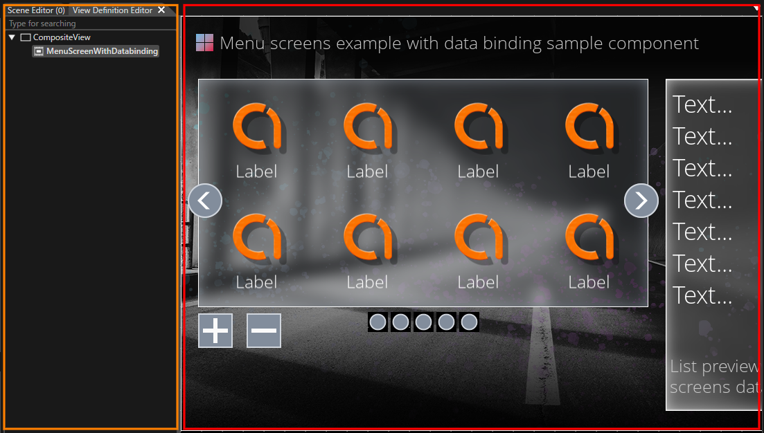
Double-click any **View** in **Solution Explorer** to open the **View Definition Editor** panel.
| **UI item** | **Description** |
|---|
| **View Composition pane** (orange frame in the figure above)
| Lists which **Scenes/Views** the selected **View** is composed of. Add or remove Scenes and existing Views by **drag and drop**.
|
| **Preview area** (red frame in the figure above)
| Displays preview images of the **Scenes/Views** associated with the View in the right pane, where you can also adjust their layout positions. Useful for improving visual identification when referencing this View from the **State Machine** or **View Tree**.
|
### Basic operations
This section outlines common procedures for defining and editing Views with the **View Definition Editor**.
For instructions on creating a **View**, see the [View feature overview page](https://doc3161en.candera.eu/books/view-editor/page/view).
#### View composition
In the **View Definition Editor** panel, you can use the tree structure to edit or delete child Views under the currently opened View. You can also review the entire tree rooted at that View on the tree, including the hierarchical relationships of its child Views and their descendant Views.
The composition editing described here applies to Views created as Composite Views. A Scene with IsView=true is treated as a standalone single-screen View, so you cannot edit its tree structure or add child elements in the View Definition Editor (it is always treated as a leaf node).
1. In the Solution Explorer, double-click the **View** (Composite View) whose composition you want to edit.
2. In the View composition pane, edit the elements to include in the View.
- You can drag and drop a **Scene with IsView=true** or an existing View from the Solution Explorer to add it.
- To remove an unnecessary element, select it and then select **Delete** from the context menu.
##### Behavior When You Drag and Drop a Scene with IsView=true
Only **Views** appear as nodes in the tree of the View Definition Editor panel. However, because a Scene with **IsView=true** is treated as a View on its own, you can add it directly to the tree.
- When you drag and drop a Scene with **IsView=true** from the Solution Explorer onto the composition pane of the Composite View open in the View Definition Editor, the Scene is added as a child element.
- A Scene with **IsView=false** is not included as a View candidate, so you cannot drag and drop it onto the composition pane. You must first select **IsView** in the Properties panel.
With this mechanism, the View Definition Editor tree can consistently treat the unit of screen transitions and visibility control as **Views**, while still allowing you to build Scene-based content within those Views.
##### Grandchild View
In the View Definition Editor panel, a single operation can add only "a child View one level below the View you have opened." To build structures with three or more levels — such as parent View > child View > grandchild View — start from a **Composite View** (a View that bundles multiple Views).
- Place **Composite Views** at the parent and intermediate levels (because they are not leaf nodes, they can hold child Views beneath them).
- A **Scene with IsView=true** is always treated as a leaf node and cannot be used as an intermediate node in a grandchild hierarchy.
Using a View that meets these requirements as the starting point, create a three-level structure (**Parent View > Child View > Grandchild View**) as follows:
1. Open the View you want to use as the parent level, and add a child View under it (**Parent View > Child View**).
2. Double-click the View you added as the child View in step 1 to open it, and then add another View under it as its child (**Child View > Grandchild View**).
After performing these steps, reopen the original parent View. You can then confirm in the tree that a three-level hierarchy (**Parent View > Child View > Grandchild View**) is displayed.
# View Tree
**View Tree** is the editor for arranging [**View**](http://cgi316en.candera.eu/books/view-editor/page/view) in the solution as a tree and composing screen transition logic based on that structure. When you define transition relationships between Views on the tree, that information is exported as the **Global State Machine** at asset generation and becomes available as destination candidates for the [**JumpToView** action behavior](http://cgi316en.candera.eu/link/582#bkmrk-jump-to-view).
When you set a parent–child relationship between Views, the child View is activated in sync when the parent View becomes active, allowing you to manage groups of screen elements that should always be shown together. In addition, by associating an Action Chain created in the [**Action Chain Editor**](http://cgi316en.candera.eu/books/view-editor/page/action-chain-editor) with each View, you can define that View’s event logic and conditional transitions.
### View Tree panel UI
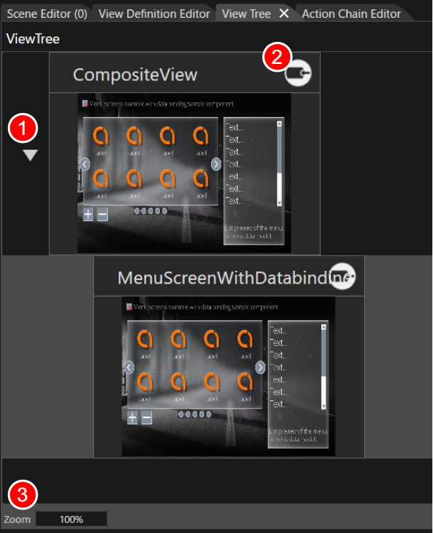
The **View Tree** panel is hidden by default. To show the panel, do either of the following:
- Select **View** > **View Editor** > **View Tree** from the toolbar menu.
- In **Solution Explorer**, double-click [an existing **View Tree**](#bkmrk-create-a-new-conditi).
| 1 | **Expand/Collapse icon** | Appears when parent-child Views exist in the View Tree. Clicking this icon shows or hides the child Views. |
| 2 | **Status indicator** | An identifier icon displayed on a ViewTreeItem when an Action Chain or an OnEntry / OnExit behavior is assigned to it. The display updates automatically according to the behavior's configuration status.
|
| 3 | **Zoom** | Enlarges or reduces the thumbnail display inside the View Tree.
In addition to clicking, you can also enter a value directly in the Zoom display area or use the mouse wheel on the panel to enlarge or reduce the display (this behavior is common to other SceneComposer editors).
|
### Basic operations
#### Create a new View Tree
Follow these steps to create a new **View Tree**:
1. In **Solution Explorer**, open the context menu at the desired location.
2. Choose **Add > New Item**.
- The **Add New Item** dialog opens.
3. In the left menu of the dialog window, select **View Tree** and click the **OK** button.
- **View** and **View Tree** in the left menu of the dialog appear with distinct icons, so you can visually distinguish between them before selecting.
- The name set in **Name** becomes the name of the new View Tree.
4. A new View Tree is created in the Solution Explorer.
- In the Solution Explorer, a **View Tree** appears with a dedicated icon distinct from that of a **View**.
5. When you double-click the newly created View Tree, the View Tree panel is selected.
For the View Tree you created, you can use [the standard operations](http://cgi316en.candera.eu/link/46#bkmrk-copy%2C-clone%2C-rename-) in **Solution Explorer** to **copy**, **duplicate**, **delete**, and **rename** it.
#### Place Views
Views defined in the [**View Definition Editor**](http://cgi316en.candera.eu/books/view-editor/page/view-definition-editor) are configured by dragging & dropping them onto the View Tree panel. Depending on how you place them, the structural relationships between Views and their display behavior will differ.
**Vertical placement:** If you drop a View into an empty area below an existing View, it is placed as a View at the same hierarchy level. In this case, each View is controlled independently and does not affect the others.
**Parent-child placement:** If you drop a View onto an existing View itself, a parent-child relationship is established. This relationship provides the following structural and behavioral benefits.
| Effect
| Description |
|---|
| Show parent and child together | When the parent View becomes active, the child View is shown at the same time. This is suitable for elements that should always be visible, such as headers or navigation. |
| Event linkage | Actions configured for the parent View (in the Action Chain Editor) are automatically propagated to and triggered for the child View as well. |
| UI structuring | By placing multiple child Views, you can compose the screen by splitting it into multiple blocks (for example, a navigation area and a main view). |
| Visualized hierarchy | In the View Tree, the View above is visually shown as the parent and the View below as the child, making the structure easy to understand. |
Operations on the **Action Chain Editor** panel are available only after you have created a **View** in the [**View Tree**](https://doc3161en.candera.eu/books/view-editor/page/view-tree).
In the Action Chain Editor, a Condition node references the Condition Output created in the **[Condition Editor](https://doc3161en.candera.eu/books/view-editor/page/condition-editor)**. You must define a Condition Block—and within it the Condition Output that represents the evaluation result—beforehand.
### Action Chain Editor panel UI
#### Panel layout
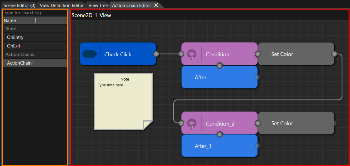
The Action Chain Editor consists primarily of the following two panes.
By default, the **Action Chain Editor** panel is hidden. To display it, choose **View > View Editor > Action Chain Editor** from the menu bar.
| **UI items** | **Description** |
|---|
| **Left pane** (orange frame in the figure above)
| Manages the State (OnEntry / OnExit) of the selected View and multiple Action Chain diagrams in a hierarchical structure.
The display has a two-layer structure: the two items OnEntry / OnExit under the State section, and the regular Action Chain diagrams listed under the ActionChains section. You can perform operations such as create, open, rename, and delete.
|
| **Right pane** (red frame in the figure above)
| The workspace for editing the selected **Action Chain** diagram. Place and connect **Trigger**, **Action**, and **Condition** nodes to define the processing flow.
|
##### Left pane
The left pane displays Action Chain diagrams and the following two sections associated with the selected View in a hierarchical structure.
- State section: Two fixed items for editing the View's OnEntry / OnExit action arrays.
- ActionChains section: The list of regular Action Chain diagrams created per trigger.
| Menu | **Description** |
|---|
| New Diagram | Creates a new Action Chain diagram. Use it under the ActionChains section (disabled when the OnEntry / OnExit item is selected). |
| Open | Opens the item selected in the left pane (an ActionChain diagram or OnEntry / OnExit) in the right pane. |
| Rename | Renames the diagram selected in the left pane. Available only under the ActionChains section (OnEntry / OnExit are fixed items and cannot be renamed). |
| Delete | Deletes the diagram selected in the left pane. Available only under the ActionChains section (OnEntry / OnExit are fixed items and cannot be deleted). |
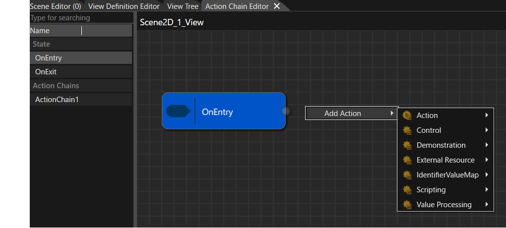
##### OnEntry / OnExit Editing Mode
When you select OnEntry or OnExit in the left pane of the Action Chain Editor, the right pane switches to OnEntry / OnExit Editing Mode and displays a dedicated pseudo-block.
- The diagram area in the right pane displays the OnEntry or OnExit pseudo-block as the start of the sequence.
- You can add actions from the Add Action context menu on the right side of the pseudo-block to build a sequential action array.
- Added or removed actions are synchronized bidirectionally with the target View's OnEntry property or OnExit property.
- Unlike regular Action Chains, adding or editing Trigger / Condition / Else nodes is restricted in this mode.
The actions registered in OnEntry / OnExit are executed in registration order at the moment the target View becomes active (OnEntry) or becomes inactive (OnExit).
| Menu | **Description** |
|---|
| Add Trigger | Select a trigger node that serves as the entry point of the Action Chain.
Use this menu to select the **Condition behavior** or **Behavior Building Block** (including Condition behaviors) that you want to use as the trigger. You can also create it by dragging and dropping a Condition behavior from the toolbox.
|
| Add Action | Places a node that represents the action to execute.
Select the **Action behavior** (for example, switching Views or playing an animation) or a **Behavior Building Block** (including Action behaviors) that you want to use. You can also create it by dragging and dropping an Action behavior from the toolbox.
|
| Add Condition | Select the **ConditionOutput** created in the **[Condition Editor](https://doc3161en.candera.eu/books/view-editor/page/condition-editor)**, or a **Behavior Building Block** (including Condition behaviors). Branches the subsequent flow (true/false) based on the evaluation result.
- If no ConditionOutputs are defined in the *Condition Editor*, this menu is not shown.
- ConditionOutputs that are not configured correctly are not listed in this menu
|
| Add After | Defines processing that must run afterwards regardless of whether the condition evaluated to true or false. Use this to express post-processing or common flows.
|
| Add Else | Used together with **Add Condition** menu to construct an if/else if/else logic structure. |
| Add Note | Places a free-text Note block on the diagram. An independent block for design intent, annotations, TODOs, and similar notes that cannot be connected to other nodes. For details, see [Note Block](#bkmrk-note-block). |
| Copy | Shown when a node is selected on the right pane. Copies the selected node. |
| Paste | Shown after performing Copy or Cut. Places a duplicate of the copied/cut node onto the diagram.
|
| Cut | Shown when a node is selected on the right pane. Cuts the selected node. |
| Delete | Shown when a node is selected on the right pane. Deletes the selected node. |
### Basic operations
#### Create a new diagram
To create a new Action Chain diagram, first select the target View in the **View Tree** panel.
1. In **View Tree**, select the View you want to define an Action Chain for.
2. Open the **Action Chain Editor** using either of the following:
- Double-click the target View
- Right-click the target View and choose **Open Action Chain Editor**.
3. In the **left pane** of the Action Chain Editor, open the context menu and select **New Diagram**.
- A new Action Chain is created under the **ActionChains** section.
- Rename the diagram as needed.
State > OnEntry / OnExit in the left pane are fixed items, and New Diagram applies only to items under the ActionChains section. For details on editing actions in OnEntry / OnExit, see [OnEntry / OnExit Editing Mode](#bkmrk-onentry-%2F-onexit-edi).
#### Note Block
You can place a free-text Note block on the Action Chain diagram. A Note block is an independent block for writing design intent, annotations, TODOs, review comments, and similar notes on the diagram.
- In the right pane, select Add Note from the context menu to place a Note block on the diagram.
- You can write any text in a Note block. The initial text is `Note / Type note here…`.
- A Note block cannot be connected to other nodes.
- To remove an unnecessary Note block, select it and then select Delete from the context menu.
#### Keyboard and Mouse Gestures
You can use keyboard and mouse gestures to edit nodes in the Action Chain Editor.
| Arrow Keys (arrow keys alone) | Moves the selected node by small increments. |
| Shift + Arrow Keys | Moves the selected node in grid units. |
| Shift + Drag | Performs a straight-line constrained move along the horizontal or vertical axis. |
| Ctrl + Drag | Duplicates the node while moving it (copy + move). |
| Alt + Drag | Performs a free move with grid snap disabled. |
These gestures also work in the Condition Editor.
#### Place a Trigger node
In an Action Chain diagram, start by placing a **Trigger** node that specifies “when to run.” The trigger hands off execution to the subsequent **Condition** group.
Place it on the right pane in either of the following ways:
- Right-click the right pane and choose **Add Trigger**, then select the trigger behavior to use from the list.
- Drag the desired trigger behavior from the **toolbox** onto the right pane.
#### Place ConditionOutput and Action nodes
A **ConditionOutput** (defined within a Condition Block) and an Action together represent one “if line.”
A **ConditionOutput** node must be created beforehand in the **[Condition Editor](https://doc3161en.candera.eu/books/view-editor/page/condition-editor)**.
- On the **right pane**, open the context menu and choose **Add Condition** to place a ConditionOutput node.
- This node references a ConditionOutput created in the **[Condition Editor](https://doc3161en.candera.eu/books/view-editor/page/condition-editor)**.
- For processing that should run when the ConditionOutput evaluates to **true**, choose **Add Action** to place an **Action** node.
- Placing an Action node immediately to the **right** of a ConditionOutput has the following meaning:
`Condition_1 + Action_1 → if (Condition_1) { Action_1(); }`
- Placing another ConditionOutput **vertically below** an existing ConditionOutput creates an **if / else if / else** block that is evaluated **top to bottom** (see the next section, “if/else if/else logic”).
#### if/else if/else logic
In an Action Chain diagram, you express `if / else if / else` by how you arrange **ConditionOutputs** and **Actions**.
- **Single row (side by side)**
- Placing a **ConditionOutput** on the left and an **Action** on the right represents `if (Condition_X) { Action_X(); }` (see [Case 2](#bkmrk-case-2%3A-nested-if-%28s) below).
- **Stacked conditions in the same column**
- From top to bottom, the rows are evaluated as `if` → `else if` → `else` (see [Case 3](#bkmrk-case-3%3A-exclusive-br)).
- Rows that include a **ConditionOutput** correspond to `if`/`else if`, and a row that has only an **Action** corresponds to `else` (see [Case 6](#bkmrk-case-6%3A-three-way-br)).
- **Nested if**
- Connecting from an **Action** node to another **ConditionOutput** node creates a nested `if`, which evaluates an additional condition after that Action (see [Cases 2](#bkmrk-case-2%3A-nested-if-%28s) and [Case 7](#bkmrk-case-7%3A-nested-if-%28a)).
#### Using After nodes
An **After** node is used to gather the “exits” of multiple branches into one.
- If you connect lines from multiple **Condition** rows to the same **After** node, all of those branches merge at that After.
- Any **Action** placed to the right of an **After** node will always run next, regardless of which path was taken.
- If you insert an **After** node and then start a new **Condition** group, you can build a structure that “executes multiple independent `if` blocks in sequence under the same trigger” (see Cases 4 and 5 below).
- Even if an **After** node is present, processing ends there unless you connect an outgoing line. Therefore, placing an After node is not mandatory; however, adding one helps to:
- Clearly mark the end of a branching block, and
- Make it easier to add common post-processing later.
### Action Chain Configuration Examples
This section shows how node arrangements on the **Action Chain** diagram (right pane) correspond to example **if** statements.
#### Case 1: Basic single-condition **if**
The simplest Action Chain: one condition and one action.
- A trigger (**Check Click**) detects the event; if the condition evaluates to **true**, a single action (**Set Color**) runs.
```c++
if (Check Click)
{
Set Color();
}
```
#### Case 2: Nested **if** (side-by-side layout)
This configuration shows how to represent a nested `if` that evaluates another condition within the branch of an existing condition.
Arrange the nodes in a single row as: **Trigger -> Condition -> Action (Set Color) -> Condition\_2 -> Action (Set Color)**.
- First, if **Condition** is true, run **Set Color**.
- Then evaluate **Condition\_2**; if it is true, also run **Set Color**.
With this **horizontal (side-by-side) layout**, you can express “an `if` inside an `if`” as a nested conditional that is evaluated after the preceding **Action**.
```c++
if (Check Click)
{
if (Condition)
{
Set Color();
if (Condition_2)
{
Set Color();
}
}
}
```
#### Case 3: Exclusive branching (if / else if)
This configuration shows how to evaluate multiple conditions for the same event **exclusively** (`if / else if`) so that **only one** action runs.
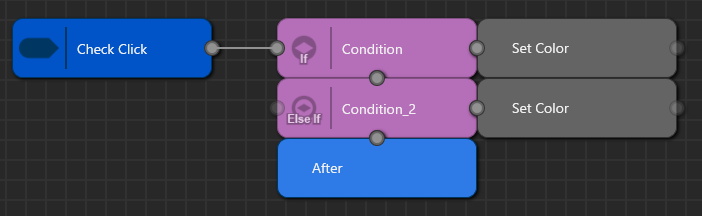
Place two rows—**Condition** and **Condition\_2**—stacked vertically **one column to the right of the Trigger**, and place their corresponding Actions (**Set Color** / **Set Color**) to the right of each row. This represents:
- Upper row: `if (Condition) { SetColor(); }`
- Lower row: `else if (Condition_2) { SetColor(); }`
To make the branch’s **common exit** explicit, place a single **After** node at the end of the block formed by **Condition** and **Condition\_2**. The After node denotes “the exit for this `if`/`else if` group,” and all subsequent processing should connect to the **right** of the After node. With this layout, it is visually clear that **regardless of which condition is met**, the flow ultimately **merges** into the same continuation.
```c++
if (Check Click)
{
if (Condition)
{
Set Color();
}
else if (Condition_2)
{
Set Color();
}
}
```
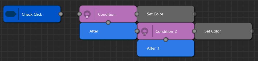
#### Case 4: Two independent **if** blocks under the same Trigger
This configuration evaluates two Conditions **independently and in sequence** within a single Trigger.
- The **After** placed beneath the `Condition + Set Color` row is a mandatory exit: the flow passes through it **whether `Condition` is true or false**, and then proceeds to **`Condition_2`**.
- As a result, `Condition_2` is **always** evaluated, regardless of the outcome of `Condition`.
- The **After\_1** placed beneath the `Condition_2 + Set Color` row marks the **end** of the entire chain.
By contrast with **Case 3**, where stacking ConditionOutputs in the same column and using a **single After** yields **exclusive branching** (i.e., the next Condition is checked **only if** the previous one was false), **Case 4** inserts an intermediate **After** between the rows so that **both `if` blocks are evaluated** in order.
```c++
if (Check Click)
{
if (Condition)
{
Set Color();
}
if (Condition_2)
{
Set Color();
}
}
```
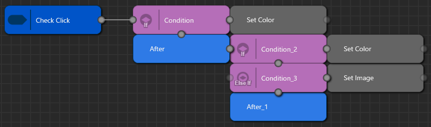
#### Case 5: Independent **if** + subsequent **if/else if** group
This configuration combines a single standalone `if` followed by an `if / else if` branching group under the same Trigger.
- **Row 1** (`Condition + Set Color`) corresponds to:
`if (Condition) { SetColor(); }`
- The **After** directly beneath Row 1 is a mandatory exit. The flow passes through it **whether `Condition` is true or false**, and then proceeds to the group formed by **Condition\_2** and **Condition\_3**.
- **Rows 2 and 3** (`Condition_2 + Set Color`, `Condition_3 + Set Image`) represent:
`if (Condition_2) { SetColor(); } else if (Condition_3) { SetImage(); }`
- When **Condition\_2** is true, **only** `SetColor()` runs; **only when it is false** is **Condition\_3** evaluated.
- The **After\_1** beneath these two rows is the **common exit** for the `if / else if` group.
Compared with **Case 4**, where both **Condition\_1** and **Condition\_2** were independent `if` blocks, **Case 5** has an **independent `if`** for **Condition\_1**, followed by an **`if / else if` group** formed by **Condition\_2** and **Condition\_3**.
```c++
if (Check Click)
{
if (Condition)
{
Set Color();
}
if (Condition_2)
{
Set Color();
}
else if (Condition_3)
{
Set Image();
}
}
```
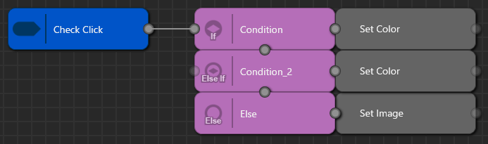
#### Case 6: Three-way branching (if / else if / else)
This configuration shows a classic **exclusive** branch with three paths under a single Trigger.
- **Row 1: “Condition + Set Color”**
Corresponds to `if (Condition) { SetColor(); }`.
**Set Color** runs only when **Condition** is true.
- **Row 2: “Condition\_2 + Set Color”**
Corresponds to `else if (Condition_2) { SetColor(); }`.
**Set Color** runs only when **Condition** is false **and** **Condition\_2** is true.
- **Row 3: “Else + Set Image”**
Corresponds to `else { SetImage(); }`.
**Set Text** runs only when both **Condition** and **Condition\_2** are false.
The key point is that **exactly one** Action runs: evaluation proceeds **top to bottom** and executes the Action on the **first** row whose condition matches.
```c++
if (Check Click)
{
if (Condition)
{
Set Color();
}
else if (Condition_2)
{
Set Color();
}
else
{
Set Image();
}
}
```
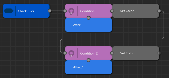
#### Case 7: Nested `if` (After-based layout)
This configuration represents a nested `if` where one **ConditionOutput** is evaluated only inside the branch of another.
- The flow goes from the Trigger **Check Click** to **Condition**—this is the outer `if (CheckClick)`.
- The row **“Condition + Set Color”** corresponds to `if (Condition) { SetColor(); … }`.
- Because there is a connector from **Set Color** down to **Condition\_2**, **Condition\_2** is evaluated **only when `Condition` is true**. If `Condition` is false, the flow does **not** proceed to `Condition_2`.
- The lower row **“Condition\_2 + Set Color”** corresponds to `if (Condition_2) { SetColor(); }`. Thus, **only when both** `Condition` **and** `Condition_2` are true do `SetColor()` and then `SetColor()` run in sequence.
- **After** and **After\_1** serve as visual **exits/merge points** for the **Condition** block and the **Condition\_2** block, respectively.
In contrast to **Case 4**, where two ConditionOutputs are treated as **two independent `if`s** that are both evaluated, **Case 7** places **Condition\_2** entirely **inside** **Condition**, forming a classic **nested `if`** structure.
```c++
if (Check Click)
{
if (Condition)
{
Set Color();
if (Condition_2)
{
Set Color();
}
}
}
```
# Condition Editor
The **Condition Editor** is a visual editor for defining conditional logic that branches the processing flow based on input devices and the solution state. Conditional logic is managed in **Condition Blocks**. Within a Condition Block, you define one or more **ConditionOutput**s that represent the evaluation results (true/false). ConditionOutputs can be referenced from Condition nodes in the **[Action Chain Editor](https://doc3161en.candera.eu/books/view-editor/page/action-chain-editor)**. They can also be assigned to the Condition property of behaviors and Fusion, allowing the same conditional logic to be reused in multiple places across the solution.
### Tool UI overview
#### Panel layout
Double-click any **Condition Block** in **Solution Explorer** to open the **Condition Editor** panel. On this panel, you build a logical expression by placing and connecting **Check / AND / OR / NOT** nodes. Condition Blocks you create here can be referenced from the [**Action Chain Editor**](https://doc3161en.candera.eu/books/view-editor/page/action-chain-editor).
By default, the **Condition Editor** panel is hidden. To display it, choose **View > View Editor > Condition Editor** from the menu bar.
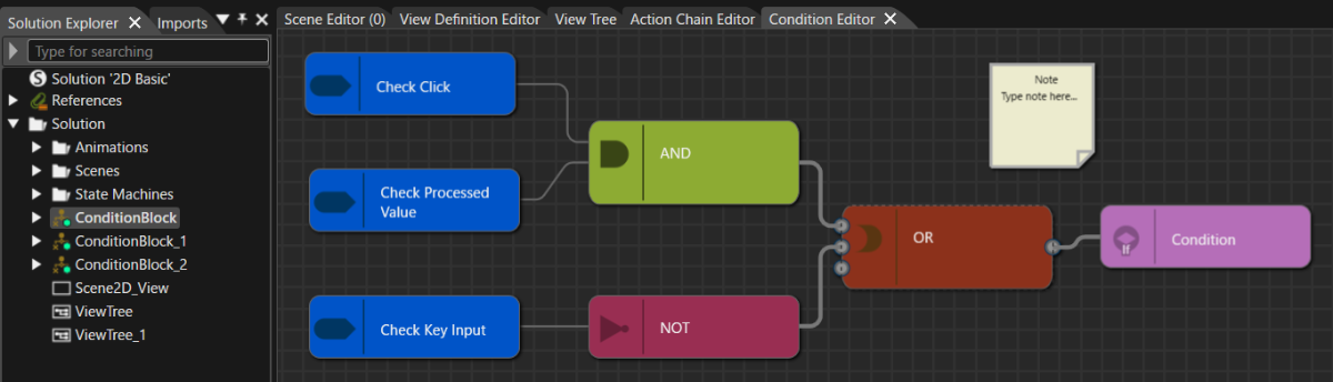
On the **Condition diagram**, you can place and connect nodes via the context menu. When you open a **Condition Block** in the Condition Editor, a default ConditionOutput node is placed automatically on the diagram. ConditionOutputs can be added or deleted as needed. The properties of nodes placed on the diagram can be edited in the **Properties panel**.
A **ConditionOutput** node represents the evaluation result (true/false) of the logical expression defined in the **Condition Block**. The logical expression you create in the Condition Editor is stored under each **ConditionOutput** node name and can be referenced from the **Action Chain Editor**. The same ConditionOutput can also be assigned to the Condition property of behaviors and **Fusion**.
| **Node type** | **Description** |
|---|
| Add Check | Select a **Check** node that serves as the entry point for configuring the condition expression.
Use this menu to select the **Condition behavior** or **Behavior Building Block** (including Condition behaviors) that you want to use as the starting point. You can also create it by dragging a Condition behavior from the toolbox onto the diagram.
|
| Add AND / OR / NOT | These are logical operator nodes that combine multiple **Check** nodes and sub-conditions. Use **AND / OR / NOT** to express composite conditions. |
| Add OUTPUT | Add a new **ConditionOutput** node. |
| Add Note | Places a free-text Note block on the diagram. An independent block for design intent, annotations, TODOs, and similar notes that cannot be connected to other nodes. For details, see [Note Block](#bkmrk-note-block). |
| Copy / Cut / Delete / Paste | This menu becomes available when a node on the diagram is selected. It lets you **copy**, **cut**, **delete**, and **paste** the selected node. |
### Basic operations
#### Create a new Condition Block
Follow these steps to create a new **Condition Block**:
1. In **Solution Explorer**, open the context menu at the desired location.
2. Choose **Add > New Item**.
- The **Add New Item** dialog opens.
3. In the dialog’s left pane, select **Condition Block**, then click **OK**.
- The value you enter in **Name** becomes the new Condition Block’s name.
- The [**Category** setting determines](#bkmrk-create-a-new-conditi) which category (location) the Condition Block is registered under in the toolbox.
4. A new **Condition Block** is created in **Solution Explorer**.
- At the same time, the Condition Block you created is added to **Behaviors** in the **toolbox**.
- For details on where it is placed, see [Reusing a Condition Block](#bkmrk-reusing-a-condition-) below.
5. Double-click the newly created Condition Block to launch the **Condition Editor**.
- On the Condition Editor panel diagram, there is a ConditionOutput node named **Condition**.
#### Reusing a Condition Block
The created ConditionBlock and each ConditionOutput within the ConditionBlock are registered in the toolbox. By dragging and dropping a ConditionBlock or ConditionOutput from the toolbox, you can reuse the same condition logic in the following places:
- **Condition Editor**: Place it as a Check node that references an existing ConditionOutput.
- **Action Chain Editor**: Assign it to the **Condition** property of a Condition node.
- **Behaviors/Fusion**: Assign the ConditionOutput to the **Condition** property of the corresponding behavior.
Also, where a **Condition Block** appears within the toolbox’s Behaviors categories depends on whether the Category property is set.
- If **Category is set**: A category with the same name is added under the toolbox’s Behaviors, and the Condition Block is shown there.
- If **Category is not set**: The Condition Block is automatically shown under an appropriate category in the toolbox’s Behaviors, depending on the conditions you configured.
To check which category it appears in, select the target Condition Block in the Solution Explorer, then see **General > Category** in the Properties panel.
For the created Condition Block and the **ConditionOutput** nodes placed within the Condition Block, you can use [the standard operations](https://doc3161en.candera.eu/link/46#bkmrk-copy%2C-clone%2C-rename-) in **Solution Explorer** to copy, duplicate, delete, and rename them.
#### Creating a Condition diagram
1. In **Solution Explorer**, double-click any Condition Block.
- The **Condition Editor** panel opens.
- On the panel, there is a ConditionOutput node named **Condition**.
2. On the right pane, open the context menu, choose **Add Check**, and select the Condition behavior to use.
- It is placed on the diagram as a **Check** node.
3. Place **AND / OR / NOT** nodes as needed and build the logical expression.
4. As needed, add **AND / OR / NOT** nodes and connect the **Check** nodes to construct the expression.
5. Connect the **ConditionOutput** node at the end of the diagram.
- Logical expressions created in the Condition Editor are saved under the name of each ConditionOutput node and can be referenced from Condition nodes in the Action Chain Editor.
- The same ConditionOutput can also be assigned to the **Condition** property of the corresponding behaviors/Fusion for reuse.
#### Note Block
You can place a free-text Note block on the Action Chain diagram. A Note block is an independent block for writing design intent, annotations, TODOs, review comments, and similar notes on the diagram.
- In the right pane, select Add Note from the context menu to place a Note block on the diagram.
- You can write any text in a Note block. The initial text is `Note / Type note here…`.
- A Note block cannot be connected to other nodes.
- To remove an unnecessary Note block, select it and then select Delete from the context menu.
#### Keyboard and Mouse Gestures
You can use keyboard and mouse gestures to edit nodes in the Action Chain Editor.
| Arrow Keys (arrow keys alone) | Moves the selected node by small increments. |
| Shift + Arrow Keys | Moves the selected node in grid units. |
| Shift + Drag | Performs a straight-line constrained move along the horizontal or vertical axis. |
| Ctrl + Drag | Duplicates the node while moving it (copy + move). |
| Alt + Drag | Performs a free move with grid snap disabled. |
These gestures also work in the Condition Editor.
# Tutorial
# Preparing Scenes and Views
This page covers the preparation of the foundation used throughout the subsequent pages. Starting from the Empty solution, you will set up a learning environment, configure the Render Targets, and create the basic scenes — Background, Header, MainContent, and DetailContent — along with the corresponding Views for each.
In the subsequent pages, you will use these elements to learn about screen switching with sibling Views, screen structuring with parent-child Views, and conditional transitions using the Action Chain Editor and Condition Editor.
### Preparing the solution
In this task, you prepare a learning environment free from the influence of existing samples. If unnecessary scenes or State Machines remain from the start, they can be difficult to distinguish from the structures you are about to create, so it is important to clean them up first.
1. Create a new solution from the sample solution Empty.
2. In the Solution Explorer, delete the Scene2D and Scene3D scenes from Scenes.
3. Select Render Targets under Scenes and configure the following properties in the Properties panel:
| Property Category | Item | Value |
| Render Target | Auto Swap | True |
| | Auto Clear | True |
4. Next, delete the GlobalStateMachine from the State Machine in the Solution Explorer.
5. Save the solution with a name of your choice.
This configuration enables the system to update the display all at once after the entire Render Target finishes drawing, rather than reflecting each camera's rendering to the display individually. However, to prevent afterimages from the previous screen, the critical factor is ensuring that the Background scene (created next) correctly handles color buffer clearing.
| Property Category | Item | Value |
| Camera | Sequence Number | 0 |
| | Clear Color Buffer | True |
| | Enable Swapping | False |
3. Place a 2D Text Node from the Toolbox onto the Scene Tree of the Background scene.
| Property Category | Item | Value |
| Transform | Position X | 0 |
| | Position Y | 0 |
| 2D Text Node | Text | Background |
The Background scene requires Clear Color Buffer to be set to True. This clears the previous color content before drawing a new frame, so even when subsequent content scenes overlay their rendering with Clear Color Buffer set to False, the screen is less likely to appear doubled. Note that because the Background scene serves as both the shared background and the clearing handler, it is safer not to include screen-specific decorations in this scene.
### Header Scene
Here, you create a shared display element that multiple screens reuse. The Header is an element displayed in both MainView and DetailView, so you will later extract it as an independent View for reuse.
1. Create a new 2D Scene and name it **Header**.
2. Select the camera in the Scene Tree and configure the following properties in the Properties panel: | Property Category | Item | Value |
| Camera | Sequence Number | 2 |
| | Clear Color Buffer | False |
| | Enable Swapping | False |
3. Place a 2D Text Node from the Toolbox onto the Scene Tree of the Header scene. | Property Category | Item | Value |
| Transform | Position X | 300 |
| | Position Y | 10 |
| 2D Text Node | Text | Common Header |
The Header is a layer that simply overlays on top of the background and content. If you clear the color buffer here, you might erase previously drawn elements. By assigning a Sequence Number that places the Header in front of the background and the content, the Header achieves a natural stacking order as a heading.
### MainContent Scene
In this task, you create the main screen content used for the first screen switch. The buttons you add here serve as the entry point for building sibling View transitions in the next page.
1. Create a new 2D Scene and name it **MainContent**.
2. Select the camera in the Scene Tree and configure the following properties in the Properties panel:
| Property Category | Item | Value |
| Camera | Sequence Number | 1 |
| | Clear Color Buffer | False |
| | Enable Swapping | False |
3. Place a 2D Text Node from the Toolbox onto the Scene Tree of the MainContent scene. | Property Category | Item | Value |
| Transform | Position X | 50 |
| | Position Y | 50 |
| 2D Text Node | Text | Main Screen |
4. Next, add two TextButton controls and configure each as follows:
| Property Category | Item | Value |
| TextButton 1 |
| General | Name | OpenDetailButton |
| Transform | Position X | 100 |
| | Position Y | 100 |
| Control | Text | Open Detail |
| TextButton 2 |
| General | Name | OpenNavigationButton |
| Transform | Position X | 400 |
| | Position Y | 100 |
| Control | Text | Open Navigation |
MainContent is a standard content scene placed on top of the background, so Clear Color Buffer remains set to False. The Background scene handles the clearing, and this scene only overlays the screen content on top of that background.
### DetailContent Scene
Here, you create the content for the DetailView. The Back button is used for return transitions between sibling Views, and the CheckBox is used as a control input for conditional automatic transitions in a later page.
1. Create a new 2D Scene and name it **DetailContent**.
2. Select the camera in the Scene Tree and configure the following properties in the Properties panel: | Property Category | Item | Value |
| Camera | Sequence Number | 1 |
| | Clear Color Buffer | False |
| | Enable Swapping | False |
3. Place a 2D Text Node from the Toolbox onto the Scene Tree of the DetailContent scene. | Property Category | Item | Value |
| Transform | Position X | 50 |
| | Position Y | 50 |
| 2D Text Node | Text | Detail Screen |
4. Next, place a TextButton control and configure the following properties: | Property Category | Item | Value |
| General | Name | BackButton |
| Transform | Position X | 100 |
| | Position Y | 100 |
| Control | Text | Back |
5. Finally, add a CheckBox control and configure the following properties:
| Property Category | Item | Value |
| General | Name | KeepDetailOpenCheckBox |
| Transform | Position X | 100 |
| | Position Y | 200 |
| Control | Text | Keep Detail Open |
### Configuring Scenes as Views
At this stage, you make the foundational components used in the subsequent pages referenceable as Views. When you set a Scene's IsView property to true, that Scene becomes referenceable as a View.
1. Select each of the four scenes created in the previous steps (Background / Header / MainContent / DetailContent) and select the IsView checkbox in the Scene category of the Properties panel.
Because the Scene name is used as the View Identifier as is, specify the same names (Background / Header / MainContent / DetailContent) when referencing them from the View Definition Editor in the subsequent pages.
In the next page, you will combine these Views to compose MainView and DetailView, and learn how to switch between them as sibling relationships on the View Tree.
# Screen Transitions with View Tree
In this page, you use the basic Views prepared in the previous page to compose two screen-level Views, MainView and DetailView, and arrange them as siblings in the View Tree.
The central themes of this page are how to assemble a single screen in the View Definition Editor and why a sibling relationship in the View Tree is suited for mutually exclusive screen switching. You also configure Jump To View on a button and verify in the Player that MainView and DetailView switch without overlapping. This page is the core part for learning the basics of the View Editor — defining screen-level Views and using sibling View transitions.
### Creating MainView
Here, you bundle the background, the common header, and the main content into a View that represents the entire main screen. Proceed while understanding that the View Definition Editor is "the place to assemble a screen-level View."
1. In Solution Explorer, select the Solution folder and select **Add > New Item** from the context menu.
2. In the **New Item** dialog, select View and name it MainView.
3. Double-click the created MainView to open the View Definition Editor.
4. Add the following elements to the left pane of the View Definition Editor:
- Background
- Header
- MainContent
MainView is a View that bundles the background, the common header, and the contents of the main screen into a single screen state. It is also important that you reuse Header as an existing View — this teaches the idea of extracting shared components as separate Views and reusing them.
### Creating DetailView
Next, you define a View that represents the entire detail screen. As with MainView, you use the background and header as shared components, and only the content portion differs. This lets multiple screens share the same visual framework while only switching their content.
1. In Solution Explorer, select the Solution folder and select **Add > New Item** from the context menu.
2. In the **New Item** dialog, select View and name it DetailView.
3. Double-click the created DetailView to open the View Definition Editor.
4. Add the following elements to the left pane of the View Definition Editor:
- Background
- Header
- DetailContent
DetailView is also an independent View that represents the entire screen. Because it shares the same background and header as MainView and only replaces the content, you can easily perform screen-level switching in the View Tree later.
### Configuring MainViewTree
Here, you place MainView and DetailView in the View Tree. The most important point is to make the two a sibling relationship. A sibling relationship is suited for switching between independent screen states.
1. In Solution Explorer, select the Solution folder and select **Add > New Item** from the context menu.
2. In the **New Item** dialog, select ViewTree and name it MainViewTree.
3. Double-click the created MainViewTree to open the View Tree panel.
4. Drag and drop MainView onto the View Tree panel to add it as a top-level View State.
5. In the same way, drag and drop DetailView into the empty area below MainView to add it as a top-level View State.
#### Verifying the Sibling Relationship in the View Tree
- MainView and DetailView are at the same hierarchical level (DetailView is not a child of MainView).
- The two are targets to switch between exclusively.
If you drop DetailView onto the body of MainView here, you create a parent-child relationship, and the resulting structure may unintentionally behave close to simultaneous display. Because you want to switch between the entire screens this time, always drop into the empty area below to place them as siblings.
### Configuring Transitions Between Views
From here, you make it possible to move between the sibling Views defined in the View Tree using Jump To View. The key point is that you specify the completed screen-level View as the transition target, not a content View.
1. Double-click the MainContent scene to open the Scene Editor.
2. In the Scene Tree, select OpenDetailButton.
3. Drag and drop a Jump To View behavior onto Action in the Extra Scene Tree.
4. Select the added Jump To View behavior and configure the following properties in the Properties panel:
| Property Category | Item | Value |
| General | Name | JumpToDetailView |
| Asset | View | DetailView |
You specify DetailView (a Composite View that includes the background and header) — not DetailContent (a Scene with IsView=true on its own) — as the transition target because you want to switch at the screen level, including the background and header. The flow of treating a Composite View created in the View Definition Editor as a state in the View Tree connects here.
In the same way, configure the return transition from DetailView to MainView. This completes the round-trip switching between sibling Views.
1. Double-click the DetailContent scene to open the Scene Editor.
2. In the Scene Tree, select BackButton.
3. Drag and drop a Jump To View behavior onto Action in the Extra Scene Tree.
4. Select the added Jump To View behavior and configure the following properties in the Properties panel:
| Property Category | Item | Value |
| General | Name | JumpToMainView |
| Asset | View | MainView |
### Verifying in the Player
Here, you verify not just the switching between MainView and DetailView, but also whether the Background's clear configuration is effective. Even when the transition itself succeeds, if the previous screen remains visible, the cause is more often on the Background side than in the View Tree.
1. Save the solution and launch the Player.
- Verify that MainView is displayed immediately after launch.
2. Click the Open Detail button.
- Verify that the screen switches to DetailView.
3. Click the Back button.
- Verify that the screen returns to MainView.
In this page, you composed MainView and DetailView as screen-level Views in the View Definition Editor and placed them as siblings in the View Tree. You also implemented basic screen switching between sibling Views using Jump To View. In the next page, you learn a different use case — a parent-child relationship that switches only a local state while preserving the shared display.
# Structuring Screen Transitions with Parent-Child View States
In this page, you define NavigationView as a parent Composite View, and inside it, you build a structure that switches between NavigationMain (a Scene with IsView=true) and RouteDetailsView (a Composite View) as child View States. What you learn here is that, unlike the sibling relationship in the previous page, a parent-child relationship is suited for "switching only a local state while maintaining the shared display." By switching between the normal display and the detail display while maintaining the map and shared buttons inside NavigationView, you understand the practical use of the parent-child structure in the View Tree. You also revisit the composition that combines a Composite View with a Scene that has IsView=true.
### Creating Shared Scenes for Navigation
First, you prepare the elements that you want to display continuously while NavigationView is active. Here, you handle the map display and the Home button as shared parts, and incorporate them into the parent View definition later.
#### NavigationMap Scene
1. Create a new 2D scene and name it NavigationMap.
2. Select the camera in the Scene Tree and configure the following properties in the Properties panel:
| Property Category | Item | Value |
| Camera | Sequence Number | 1 |
| | Clear Color Buffer | False |
|
| Enable Swapping | False |
3. Place a 2D Text Node from the Toolbox onto the Scene Tree of the NavigationMap scene.
| Property Category | Item | Value |
| Transform | Position X | 250
|
| | Position Y | 200
|
| 2D Text Node | Text | Navigation Map
|
#### NavigationViewButtons Scene
1. Create a new 2D scene and name it NavigationViewButtons.
2. Select the camera in the Scene Tree and configure the following properties in the Properties panel:
| Property Category | Item | Value |
| Camera | Sequence Number | 2 |
| | Clear Color Buffer | False |
|
| Enable Swapping | False |
3. Place a TextButton control from the Toolbox onto the Scene Tree of the NavigationViewButtons scene.
| Property Category | Item | Value |
| General | Name | JumpToHomeViewButton |
| Transform | Position X | 350 |
| | Position Y | 300
|
| Control | Text | Home |
NavigationMap and NavigationViewButtons are elements that you want to remain visible while in NavigationView. Therefore, you incorporate them into the parent View definition later.
### Creating Transition Scenes for Navigation
Next, you prepare the targets to switch between inside NavigationView. Here, you separate the normal display and the route details display so that you can treat them as child states of the parent View.
#### NavigationMain Scene
1. Create a new 2D scene and name it NavigationMain.
2. Select the camera in the Scene Tree and configure the following properties in the Properties panel:
| Property Category | Item | Value |
| Camera | Sequence Number | 2 |
| | Clear Color Buffer | False |
|
| Enable Swapping | False |
3. Place a 2D Text Node from the Toolbox onto the Scene Tree of the NavigationMain scene.
| Property Category | Item | Value |
| Transform | Position X | 50 |
| | Position Y | 200
|
| 2D Text Node | Text | Navigation Main |
4. Next, place a TextButton control and configure the following properties:
| Property Category | Item | Value |
| General | Name | ShowDetailsButton |
| Transform | Position X | 50 |
| | Position Y | 300
|
| Control | Text | Show Details |
#### RouteDetailsContent Scene
1. Create a new 2D scene and name it RouteDetailsContent.
2. Select the camera in the Scene Tree and configure the following properties in the Properties panel:
| Property Category | Item | Value |
| Camera | Sequence Number | 2 |
| | Clear Color Buffer | False |
|
| Enable Swapping | False |
3. Place a 2D Text Node from the Toolbox onto the Scene Tree of the RouteDetailsContent scene.
| Property Category | Item | Value |
| Transform | Position X | 450 |
| | Position Y | 200
|
| 2D Text Node | Text | Route Details |
#### NavigationBack Scene
1. Create a new 2D scene and name it NavigationBack.
2. Select the camera in the Scene Tree and configure the following properties in the Properties panel:
| Property Category | Item | Value |
| Camera | Sequence Number | 2 |
| | Clear Color Buffer | False |
|
| Enable Swapping | False |
3. Place a TextButton control from the Toolbox onto the Scene Tree of the NavigationBack scene and configure the following properties:
| Property Category | Item | Value |
| General | Name | BackToNavigationMainButton |
| Transform | Position X | 50 |
| | Position Y | 300
|
| Control | Text | Back |
NavigationMain is for the normal display, and RouteDetailsContent and NavigationBack are components for the detail display. These are not shared displays — you treat them as targets to switch between inside NavigationView.
### Creating Navigation-Related Views
Here, you use both the case of creating a simple View from an existing Scene and the case of creating a new View that combines multiple components. This distinction is also important when learning the parent-child structure.
#### Creating Views: Using Existing Scenes
1. Select each of the five scenes created in the previous steps and select the IsView checkbox in the Scene category of the Properties panel.
- NavigationMap
- NavigationViewButtons
- NavigationMain
- RouteDetailsContent
- NavigationBack
#### Creating the New RouteDetailsView
1. Create a new View and name it RouteDetailsView.
2. Double-click the created RouteDetailsView to open the View Definition Editor.
3. Add the following elements to the left pane of the View Definition Editor:
- RouteDetailsContent
- NavigationBack
RouteDetailsView is a screen state that bundles the detail display itself and the return operation. By extracting a local grouping like this as a Composite View, you make it easier to treat it as a child View State later.
### Configuring NavigationView
Here, you bundle into the parent View only the elements that you want to remain displayed while in Navigation. It is important to include only the shared display in the parent View, and not the parts that you want to switch.
1. In Solution Explorer, select the Solution folder and select **Add > New Item** from the context menu.
2. In the **New Item** dialog, select View and name it NavigationView.
3. Double-click the created NavigationView to open the View Definition Editor.
4. Add the following elements to the left pane of the View Definition Editor:
- Background
- Header
- NavigationMap
- NavigationViewButtons
You do not include NavigationMain or RouteDetailsView in the NavigationView definition. You add these later as child View States in the View Tree, and treat them as targets to switch between under the parent. This separation clarifies the roles of the shared display and the local switching.
### Configuring MainViewTree
Here, you add NavigationView as a top-level sibling View and attach child View States inside it. This lets you experience a two-layer structure — sibling relationships at the top level and a parent-child relationship inside Navigation.
1. Double-click MainViewTree to open the View Tree panel.
2. Drop NavigationView into the empty area below MainView and DetailView to add it as a top-level View State.
3. Drop NavigationMain onto the body of the parent NavigationView to add it as a child View State.
4. Drop RouteDetailsView onto the body of the parent NavigationView to add it as a child View State.
By dropping onto the body of the parent, the child states are treated as internal states of NavigationView while it is active. This is the essence of a parent-child relationship, as opposed to a sibling relationship.
### Configuring Navigation-Related Transitions
Here, you configure both the transitions to top-level sibling View States and the switching of child View States under the parent. This shows that the same Jump To View takes on different meanings depending on the relationship of the View you jump to.
#### MainContent Scene
1. Double-click the MainContent scene to open the Scene Editor.
2. In the Scene Tree, select OpenNavigationButton.
3. Drag and drop a Jump To View behavior onto Action in the Extra Scene Tree.
4. Select the added Jump To View behavior and configure the following properties in the Properties panel:
| Property Category | Item | Value |
| General | Name | JumpToNavigation |
| Asset | View | NavigationView |
#### NavigationMain Scene
1. Double-click the NavigationMain scene to open the Scene Editor.
2. In the Scene Tree, select ShowDetailsButton.
3. Drag and drop a Jump To View behavior onto Action in the Extra Scene Tree.
4. Select the added Jump To View behavior and configure the following properties in the Properties panel:
| Property Category | Item | Value |
| General | Name | JumpToRouteDetail |
| Asset | View | RouteDetailsView |
#### NavigationBack Scene
1. Double-click the NavigationBack scene to open the Scene Editor.
2. In the Scene Tree, select BackToNavigationMainButton.
3. Drag and drop a Jump To View behavior onto Action in the Extra Scene Tree.
4. Select the added Jump To View behavior and configure the following properties in the Properties panel:
| Property Category | Item | Value |
| General | Name | JumpToNavigationMain |
| Asset | View | NavigationMain |
#### NavigationViewButtons Scene
1. Double-click the NavigationViewButtons scene to open the Scene Editor.
2. In the Scene Tree, select JumpToHomeViewButton.
3. Drag and drop a Jump To View behavior onto Action in the Extra Scene Tree.
4. Select the added Jump To View behavior and configure the following properties in the Properties panel:
| Property Category | Item | Value |
| General | Name | JumpToMainView |
| Asset | View | MainView |
The important point here is that, inside NavigationView, NavigationMain and RouteDetailsView switch between each other as child View States, while the Home button exits Navigation entirely and returns to MainView, the top-level sibling View State.
### Verifying in the Player
The purpose of this verification is to see how the meaning of the parent-child relationship is reflected in the screen display. Verify that the shared display portion is maintained while only the child state switches.
1. Save the solution and launch the Player.
- Verify that MainView is displayed immediately after launch.
2. Click the Open Navigation button.
- Verify that the screen switches to NavigationView.
- At the same time, verify that Background and Header are displayed.
- In addition, verify that Navigation Main, Navigation Map, the Show Detail button, and the Home button are displayed.
3. Click the Show Details button.
- Verify that the screen switches to Route Details.
- At the same time, verify that Background and Header are displayed.
- In addition, verify that Navigation Map and the Home button are displayed.
4. Click the Back button.
- Verify that the screen returns to Navigation Main.
5. Click Home.
- Verify that the screen returns to MainView.
In this page, you built a structure that uses NavigationView as the parent View State and switches between child View States inside it. This let you confirm in practice that a sibling relationship is suited for exclusive switching of entire screens, while a parent-child relationship is suited for switching only a local state while retaining the shared display. In the next page, you add conditional automatic transitions to DetailView using the Action Chain Editor and the Condition Editor.
# Controlling Transitions with Conditions and Action Chains
In this page, you implement a conditional automatic transition for DetailView, combining a timer with a checkbox value. The central theme is the division of roles: the Action Chain Editor is the place to build the processing flow, while the Condition Editor is the place to define the condition expression independently. You build behavior that returns to MainView after a certain time elapses after entering DetailView, while stopping the auto-transition only when the Keep Detail Open CheckBox is on. This lets you understand the coordination of triggers, conditions, and actions in practice. In particular, in this page, setting OperationMode of Check Processed Value to CompareExternalValueWithConditionValue is the key to correct behavior.
### Configuring the CheckBox Control
First, you convert the state of the CheckBox control placed in the DetailContent scene into a form readable by the Condition Editor. If you skip this step, you cannot use the current checked state in a condition expression.
1. Double-click the DetailContent scene to open the Scene Editor.
2. In the Scene Tree, select KeepDetailOpenCheckBox.
3. Drag and drop a Forward Value behavior onto the Extra Scene Tree.
4. Select the added Forward Value behavior and configure the following properties in the Properties panel:
| Property Category | Item | Value |
| Asset | EventDispatchStrategy | DedicatedBehavior |
5. Add a Value behavior under DedicatedBehavior of the Forward Value behavior.
6. Drag and drop the added Value behavior onto the DetailContent scene in the Scene Tree to associate it.
With this configuration, the current value of the CheckBox control is held on the scene node, and the Condition Editor can reference it as an external value. The target that you specify as ValueBehavior in the next step is the Value you created here.
### Configuring the ConditionBlock
Here, you define the condition logic that determines whether the automatic transition is allowed, separately from the Action Chain. Separating the condition makes it easier to understand the processing flow and the evaluation logic independently.
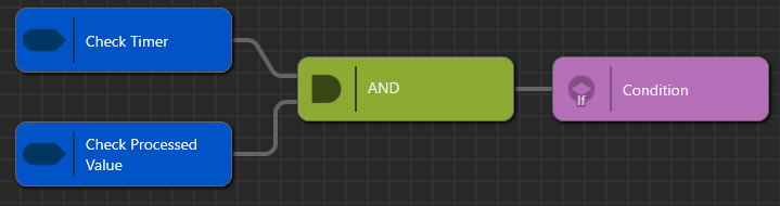
In this task, you build a condition that becomes true only when both the timer has fired and the Keep Detail Open CheckBox is off. This is the heart of the conditional transition.
1. In Solution Explorer, select the Solution folder and select **Add > New Item** from the context menu.
2. In the **New Item** dialog, select ConditionBlock and name it ReturnToMainOnTimeoutCondition.
- The Condition Editor panel appears and displays the diagram of the newly created ReturnToMainOnTimeoutCondition > Condition.
3. On the diagram, use the context menu and select **Add Check > Condition > Control > Check Timer** to add it to the diagram.
4. In the same way, from the context menu, select **Add Check > Condition > Control > Check Processed Value** to add it to the diagram.
5. Select the added Check Processed Value and configure the following properties in the Properties panel:
| Property Category | Item | Value |
| Asset | OperationMode | CompareExternalValueWithConditionValue |
| | ConditionOperator | Equal |
| | ConditionValue type | Bool |
| | ConditionValue | False |
| | ValueBehavior | DetailContent scene > Value |
6. Next, from the context menu, select **Add AND** to add an AND node.
7. Connect Check Timer and Check Processed Value to the AND.
8. Connect the output of the AND to the ConditionOutput.
The meaning of the condition built here is: allow the automatic transition only when the timer has fired and the checkbox is off. The OperationMode setting is especially important. If you set it to an in-process event-dependent mode such as CompareProcessedValueWithConditionValue, no value event to compare against exists at the time of the Timer event, and the condition is not evaluated correctly. The correct choice here is CompareExternalValueWithConditionValue, which references the external value held on the scene node.
### Configuring On Entry for DetailView
Next, configure the action that starts the timer at the moment of entering DetailView. At this point, no transition occurs yet — you only set up the reference time for the subsequent condition evaluation.
You can edit a View's OnEntry action in the OnEntry / OnExit Editing Mode of the Action Chain Editor. This tutorial uses this method.
1. Double-click MainViewTree to open the View Tree panel.
2. Double-click DetailView to open the Action Chain Editor.
3. In the left pane of the Action Chain Editor, double-click State > OnEntry.
- The OnEntry pseudo-block appears in the right pane.
4. On the right side of the pseudo-block, select **Add Action > Action > Control > Start Timer** from the context menu to add a Start Timer action.
5. Select the added Start Timer and configure the following properties in the Properties panel:
| Property Category | Item | Value |
| Asset | Delay | 3000 |
This configuration means: use the moment three seconds after entering DetailView as the timing for the automatic transition decision. Note that starting the timer and the transition itself are separate configurations. The content added to OnEntry in the Action Chain Editor is automatically synchronized with the OnEntry property of DetailView.
### Configuring the Action Chain
Finally, build a processing flow that receives the timer event, evaluates the ConditionOutput, and returns to MainView only when the result is true. This is the first point at which the Action Chain Editor and the Condition Editor work together.
1. Double-click MainViewTree to open the View Tree panel.
2. Double-click DetailView to open the Action Chain Editor.
3. In the left pane, double-click ActionChain1 to open the diagram.
4. On the diagram, from the context menu Add Condition, select the Condition of the ReturnToMainOnTimeoutCondition you created earlier to add it.
5. From the context menu, select **Add Action > Action > Views > Jump To View** and place it on the diagram.
6. Select the Jump To View and configure the following properties in the Properties panel:
| Property Category | Item | Value |
| General | Name | JumpToMainViewAfterTimeout |
| Asset | View | MainView |
Finally, snap the Jump To View action to the Condition to connect them.