
Recommended Layers Structure for Smart Importer
This page explains how to set up items so that they and their internal group items are automatically detected as controls when importing Adobe Photoshop (.psd), Adobe XD (.xd), Figma (.fig) files using the Smart Importer.
Controls that can be automatically assigned are limited to those in the Touchable, Common and Core categories.
Creating Design Files
To automatically apply controls to group items in a design file and import them into Scene Composer, the group items must be created according to the recommended layer structure.
The recommended layer structure mainly targets the text-related and image-related properties of a control. In the design file, by creating layers corresponding to these properties and assigning them the same names as the property names, the layers can be automatically mapped by the Smart Importer.
The following sections describe the specific creation steps in detail.
For Adobe Photoshop(.psd)Files
- Create a group item for the control to be assigned and name it "SC_<ControlName>". In the example below, in order to make a TextButton control, the top layer has been named "SC_TextButton" (see blue box).
- Make property layers that the control contains underneath the group item created in step 1 (see red and green boxes).
These properties include text-related properties (e.g., Text, FirstText) and image-related properties (e.g., NormalImage, PressedImage). - Use the names of the control properties for the names of these Photoshop layers. Note that any spaces in photoshop layer names should be deleted (see green boxes for comparison)
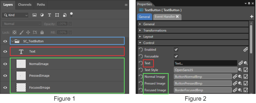
By naming a group item in the design file as “SC_<ControlName>”, Scene Composer automatically recognizes and maps it as a control.
Therefore, it is not necessary to create layers for all text-related and image-related properties of the control. Even if only the required properties are created as layers, the control will still be applied correctly.
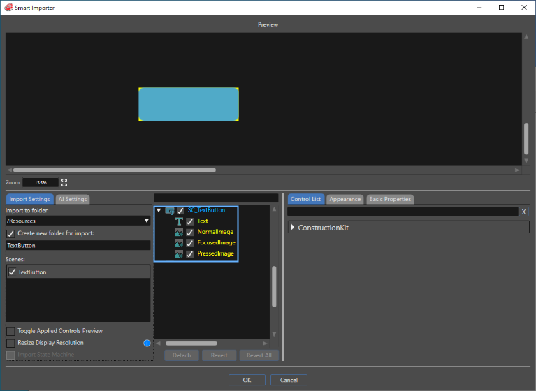
After observing the above method, select the finished photoshop file from the Scene Composer toolbar [Import] > [Smart Importer] > [From Local File...]. The Smart Importer panel will open, and the file will be loaded in line with the .psd file layers that were set. As seen in the image below, the TextButton control has already been confirmed and subsequently applied.
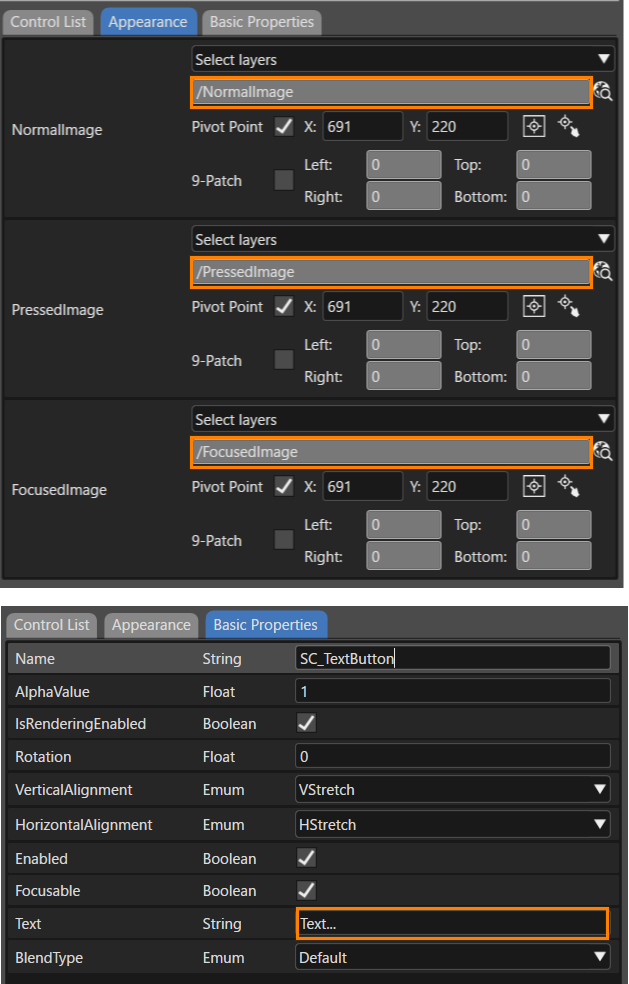
This will also be reflected on the property panel after importing is complete.
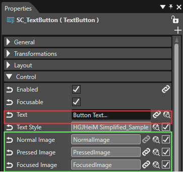
-
The size of the imported control will conform to the width and height of the largest image layer applied.
When importing nodes with mismatching layers and properties, new group nodes are created, and additional properties are added as child elements.
For Adobe XD(.xd)Files
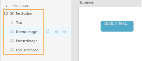
The preparation needed for .xd files is for all intents and purposes the same as with 「For Adobe Photoshop(.psd)Files」. As seen below with the TextButton example, structure the Adobe XD items to match the structure and property names of controls to be automatically applied.
For Figma(.fig)Files
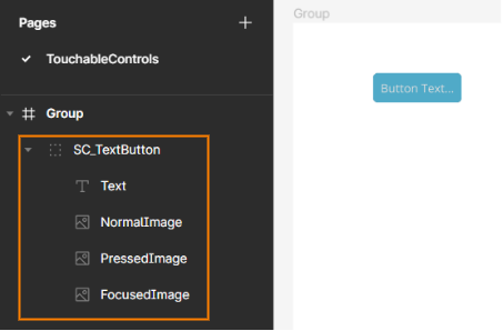
The preparation needed for .fig files is for all intents and purposes the same as with 「For Adobe Photoshop(.psd)Files」. As seen below with the TextButton example, structure the Figma items to match the structure and property names of controls to be automatically applied.
Layer Structure and Naming Guideline for Controls
In general, it is recommended to keep the PSD layer format close to the standard Controls. Below is a guide on how the layers for some Controls should be formatted and named.
Touchable
Common
- AnalogClock
SC_AnalogClock
├ SecondsNeedleImage
├ MinutesNeedleImage
├ HoursNeedleImage
└ FaceImage - Gauge
SC_Gauge
├ BackgroundImage
└ NeedleImage - Menu Icon
SC_MenuIcon
├ Image
└ BackgroundImage - Mesh2D
SC_Mesh2D
└ Image
Core
- CoreDial
SC_CoreDial
├ KnobImage
├ BackgroundImages0
├ BackgroundImages1
└ BackgroundImages2 - CoreTextButton
SC_CoreTextButton
├ NormalImage
├ PressedImage
├ DisabledImage
└ Text - CoreRadioButton
SC_CoreRadioButton
├ Text
├ NormalImage
├ SelectedImage
├ NormalDisabledImage
└ SelectedDisabledImage - CoreSlider
SC_CoreSlider
├ TrackImage
├ TrackDisabledImage
├ TrackFillImage
├ TrackDisabledFillImage
├ KnobNormalImage
├ KnobPressedImage
└ KnobDisabledImage