
Recommended Layers Structure for Smart Importer
This page explainsshows you how to set up items so that theySmart Importer automatically detects the items and their internalnested group items are automatically detected as controls when importingyou import Adobe Photoshop (.psd), Adobe XD (.xd), o Figma (.fig) files using the Smart Importer.files.
ControlsSmart thatImporter can be automatically assignedassign areonly limited to thosecontrols in the Touchable, Common and Core categories.
Creating Design Files
To automaticallyenable applythe automatic application of controls to group items in a design file and their subsequent import them into Scene Composer, the group items must be created according tofollowing the recommended layer structure.
The recommended layer structure mainlyis targetsprimarily designed to support the text-related and image-related properties of a control. In the design file, byBy creating layers correspondingthat correspond to these properties and assigningnaming them according to the sameassociated namesScene as theComposer property names, the layersSmart Importer can be automatically mappedidentify byand map the Smartlayers Importer.to the appropriate control properties.
The following sections describeprovide detailed instructions for creating the specificrequired creationlayer steps in detail.structure.
For Adobe Photoshop(.psd)Files
- Create a group item for the control that you want Smart Importer to
be assignedassign and name it "SC_<ControlName>".InFor example, name theexampletopbelow,layerin order"SC_TextButton" to make a TextButtoncontrol, the top layer has been named "SC_TextButton"control (see blue box). Make property layersthat the control containsunderneathUnder the group item that you created in step11, create property layers for the desired control (see red and green boxes).
These properties include text-related properties (e.g., Text, FirstText) and image-related properties (e.g., NormalImage, PressedImage).- Use the
names of thecontrol properties names for thenames of thesePhotoshoplayers.layerNotenames.thatDelete any spaces inphotoshopPhotoshop layer namesshould be deleted(see green boxes for comparison)
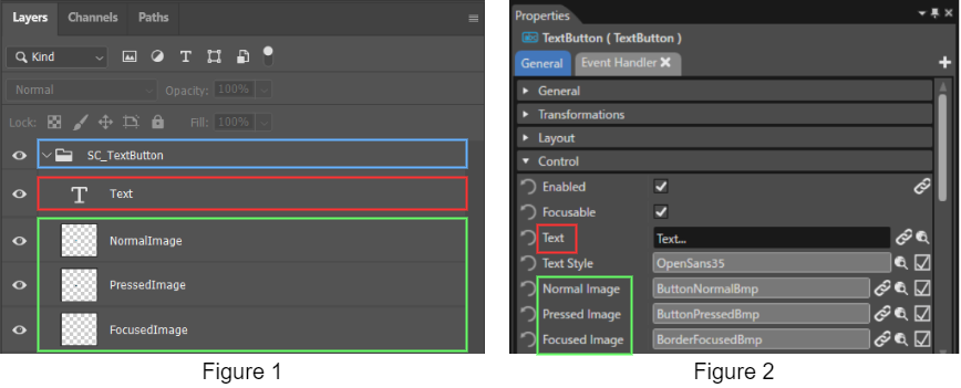
ByThe namingSmart a group item in the design file as “SC_<ControlName>”, Scene ComposerImporter automatically recognizes and maps it as a control.Therefore,group ititem that is named SC_<ControlName>” in the design file.
You are not necessaryrequired to create layers for all text-related and image-related properties of the control. Even if only the required properties are created as layers, the control will still be applied correctly.
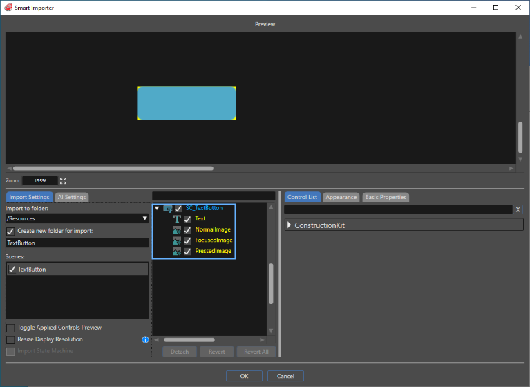
After observingfollowing the abovesteps method,above, select theImport finished> photoshopSmart fileImporter > From Local File... from the Scene Composer toolbartoolbar, [Import]then >select [Smartthe Importer]finished >Photoshop [From Local File...]. Thefile. Smart Importer panelopens willthe open,Smart andImporter panel, loads the file willaccording be loaded in line withto the .psd file layers that wereyou set.configured, Asconfirms seenthe TextButtonControl, and applies it, as you can see in the image below, the TextButton control has already been confirmed and subsequently applied.
below.
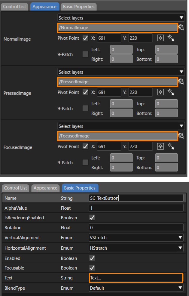
ThisThe willProperties panel also bereflects reflectedthese onsettings after Smart Importer completes the property panel after importing is complete.
import.
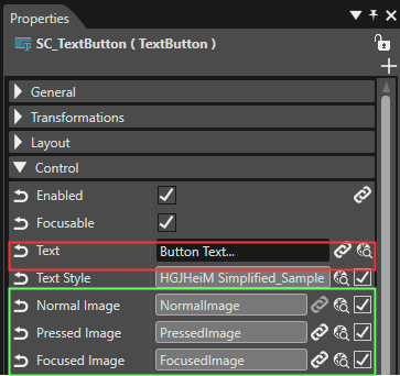
-
The imported control's size
of the imported control willconform tomatches the width and height of the largest image layer that you applied.
When importingSmart Importer imports nodes with mismatching layers and properties, it creates new group nodes are created, and additional properties are added as child elements.
For Adobe XD(.xd)Files
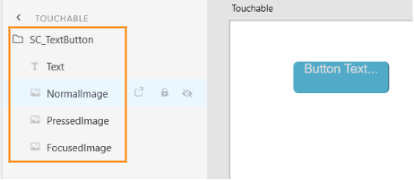
The preparation needed forPrepare .xd files is for all intents and purposesin the same way as withdescribed in 「For Adobe Photoshop(Photoshop (.psd)Files」psd) Files. As seen below with the TextButton example, structureStructure the Adobe XD items to match the structure and property names of the controls tothat beSmart Importer automatically applied.applies.
For Figma(.fig)Files
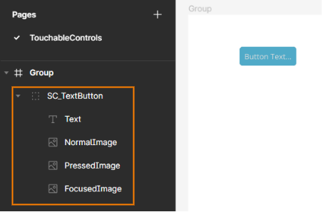
The preparation needed forPrepare .fig files is for all intents and purposesin the same way as withdescribed in 「For Adobe Photoshop(Photoshop (.psd)Files」psd) Files. As seen below with the TextButton example, structureStructure the Figma items to match the structure and property names of the controls tothat beSmart Importer automatically applied.
applies.
Layer Structure and Naming Guideline for Controls
In general, it is recommended to keep the PSD layer format close to the standard Controls.controls. BelowUse isthe afollowing guide onto howformat theand name layers for some Controls should be formatted and named.controls.
Touchable
Common
- AnalogClock
SC_AnalogClock
├ SecondsNeedleImage
├ MinutesNeedleImage
├ HoursNeedleImage
└ FaceImage - Gauge
SC_Gauge
├ BackgroundImage
└ NeedleImage - Menu Icon
SC_MenuIcon
├ Image
└ BackgroundImage - Mesh2D
SC_Mesh2D
└ Image
Core
- CoreDial
SC_CoreDial
├ KnobImage
├ BackgroundImages0
├ BackgroundImages1
└ BackgroundImages2 - CoreTextButton
SC_CoreTextButton
├ NormalImage
├ PressedImage
├ DisabledImage
└ Text - CoreRadioButton
SC_CoreRadioButton
├ Text
├ NormalImage
├ SelectedImage
├ NormalDisabledImage
└ SelectedDisabledImage - CoreSlider
SC_CoreSlider
├ TrackImage
├ TrackDisabledImage
├ TrackFillImage
├ TrackDisabledFillImage
├ KnobNormalImage
├ KnobPressedImage
└ KnobDisabledImage